Posts

Castleford Tigers 2025

Image
  Class Cas back up again with another helping from Oxen.  Home it's nice to Cas back in "proper" yellow after a number of seasons in that less than tasteful orange efforts and last years predominate black home shirt. So this looks like a proper Cas shirt, although not sold on the sash design, looks to be more a football shirt type of thing however I can see the appeal of it from the clubs point of view, very different from anything they've done before and is a move back to the traditional colours associated with Cas. Leaves me with the impression that they'll bring out a more  Away this continues the trend in the UK and especially from Oxen to produce these striking away shirts that could be for any team. Being a middle aged bloke I know that I'm not the target market for this particular design and I'm OK with that, definitely aimed at the younger market and if it helps shift a few more shirts then that can only be a good thing. In saying that, I really l...

North Queensland Cowboys 2025

Image
  First off, not a fan of the 30th anniversary badge. The 30 years is way too big and dominates the badge, the horns are almost impossible to see from a distance.  Home & Away  both the home and away designs are straight copies, or at least modern interpretations of their '95 designs. I want to like these but just feels a little too uninspiring and not sure why. Maybe it's the large white sponsors box that dominates the front of the jerseys and takes away from one of the key design elements of the hoops? I'm sure they'll end up selling them by the truckload in FNQ, but I'm just not a fan.  Alternate  this is based on their World 7's design and judging from social media it's been on the wish list of Cowboys fans for a few years. This looks so much better in terms of sponsor integration than the home and aways, the large sponsor box works well and doesn't overly ruin the overall design and the design elements from the original are carried through to th...

Leeds Rhinos 2025

Image
  The Loiners are again with Oxen.  Home  this is based off the Patrick shirt from 2005, down all the small details like the two strips on the side. The shirt above is the players version, the supporters will have the 'flappy collar' like the Patrick one. This is the third time the 2005 Patrick shirt has been used by Leeds as the basis of a home shirt, 2018 and 2022, although in 2022 it had a yellow collar. I do like it as a Leeds shirt and it looks better with the players collar than the supporters flappy collar and it's a huge improvement on last years white shirt effort.  Away having a black away shirt when your home is royal blue indicates that there will be a third shirt released in the lead up to Christmas and by bet it'll be yellow if they go down a traditional path or pink if the club goes down the modern path. This black shirt while it passes the "looks good in jeans" test so it can be worn in public without looking too garish, it just misses the mark...

Canberra Raiders 2025

Image
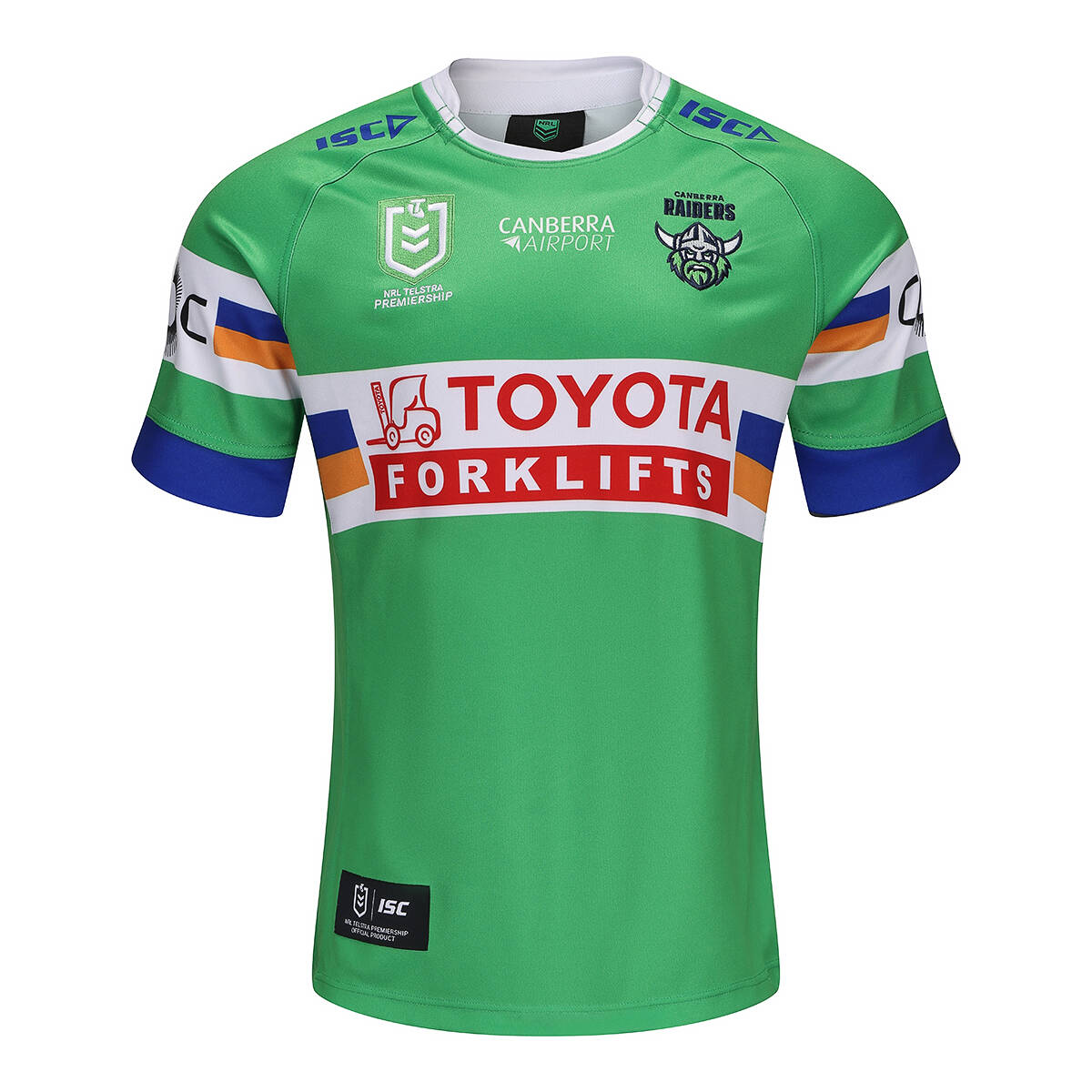
  Raiders released three jerseys recently and thought it would be a good place to start.  Yet another year with ISC for the Milk, which started in 2003.  Home there's only some minimal changes from the previous year, the collar has changed to white and the 'ACT bands' have been added to the centre of the design. This was seen on the last two years of the away jersey, which was first done way back in 1991 on the Video Ezy away jersey. Due to the size and nature of the sponsorship box the vast majority of the hoops are blocked out but that's the world we live in these days. Verdict, it's a good solid effort although which the cuffs had also changed to white as is the tradition, the collar and cuffs change together.  Away this is magnificent! It's a modern interpretation on the jersey that was worn when the Raiders played Great Britain in a tour game in 1992. It works really well as an away design against the green of the home, which in reality should only be worn ...